Tickets, please
Trying to get tickets for Google I/O can be tricky. Allocating those tickets to the teams in Google can be even more tricky. I had the opportunity to design a way to take this process from a mayhem of many Google sheets to something easy to use, automated and could be repurposed for other events across the company.
MY ROLE
UI + UX Designer
THE TEAM
3 Designers + 6 Engineers
OUR TIMELINE
6 x 2 week sprints
THE PROBLEM
Google I/O is one of the biggest events of the year with 5000+ people attending, but only around 1000 of the people who attend have purchased a ticket, all the others have been gifted them by teams within Google. The people who allocate tickets to teams in Google were using multiple Google Sheets to collate all the individual team's invitees and all their information. There were different phases of allocation, numbers of tickets would change for teams and keeping track of who had responded to the RSVPs was a mess, that took hours of effort and was often incorrect.
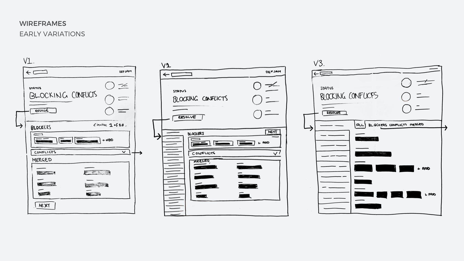
FIRST ATTEMPTS
We hypothesized that there was a simple tech solution to this problem. Our first instinct was to simply link together all of these Google Sheets, then at least they would all be in one place. I wanted to make sure we weren't making any assumptions, so I ran some user interviews to understand how the teams were choosing who to invite. I discovered that everyone was doing it completely differently. There were some teams creating Docs that had lists of potential invitees, others were simply emailing each other with the people they wanted to invite and some even had handwritten lists that they were manically typing into the Google Sheet at the last minute. This was going to be a bigger challenge to solve than we originally thought.
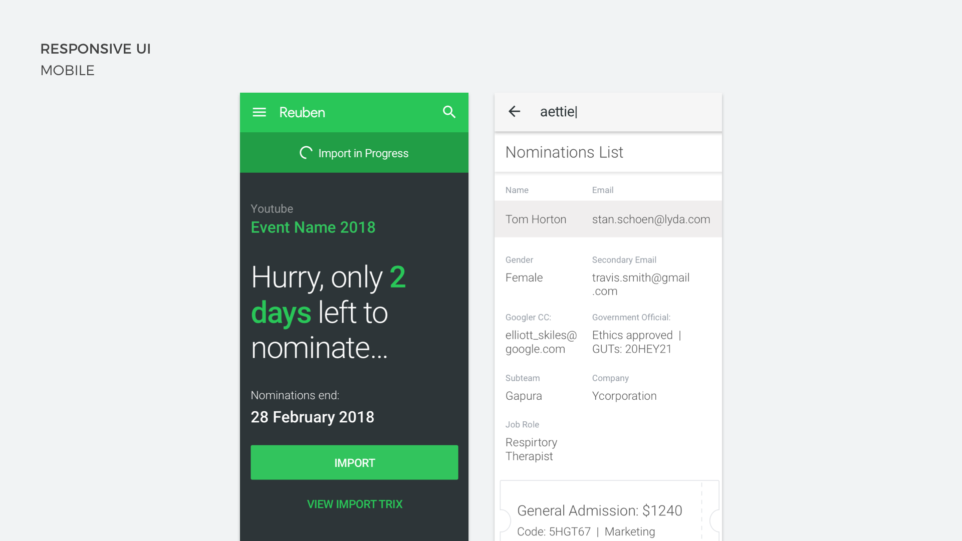
ONE-STOP-SHOP
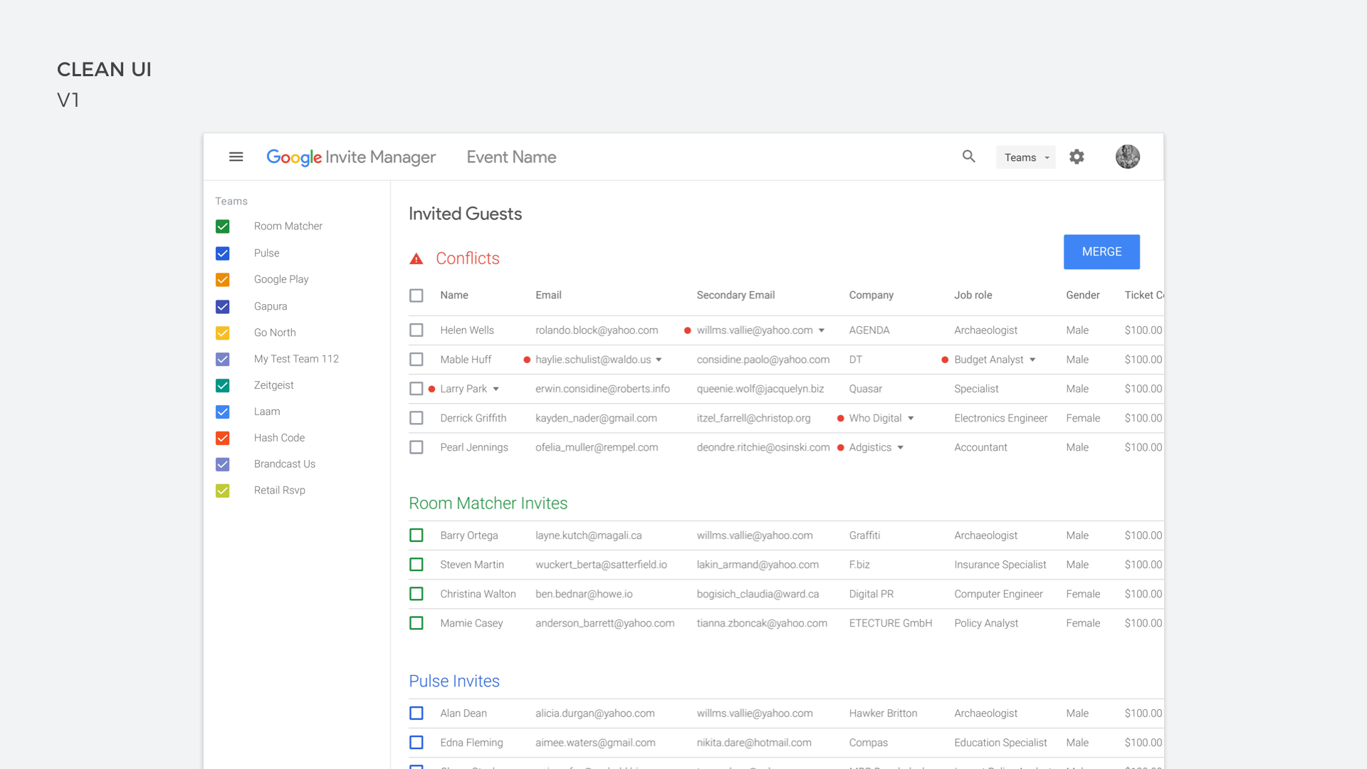
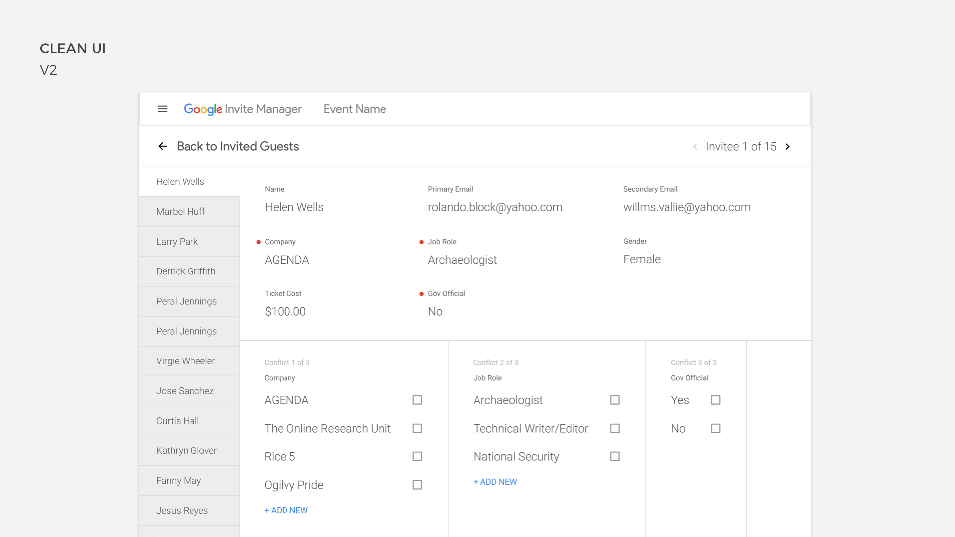
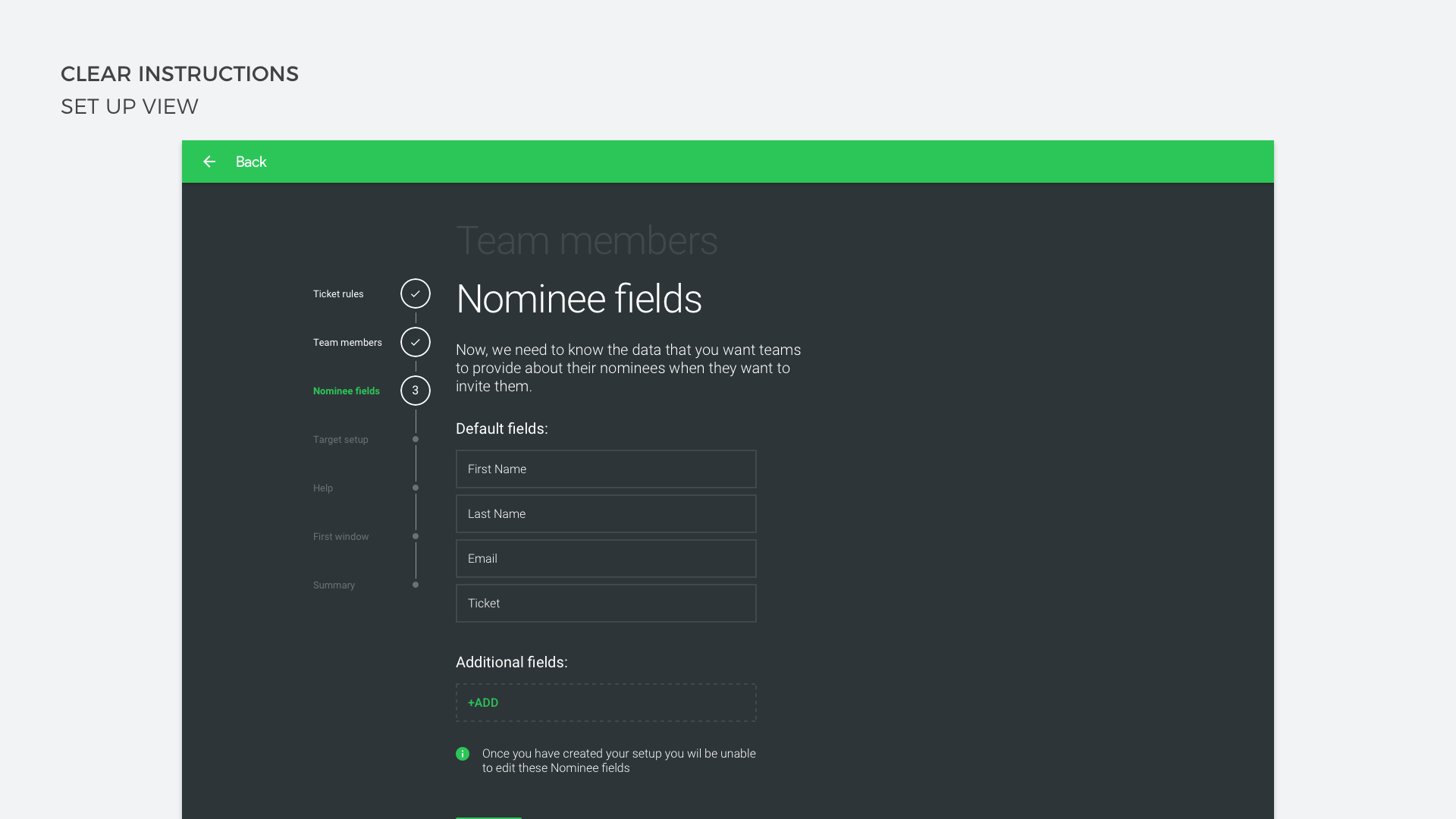
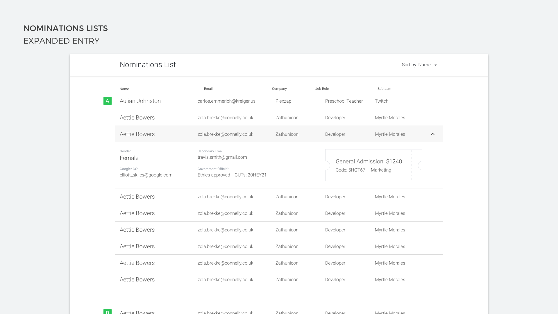
After learning about how complicated this process was for the people involved, we wanted to create a tool that would become the one-stop-shop for all information about invitees to Google I/O. A place where the people allocating tickets to teams would be able to enter numbers and targets, the teams would be able to add the information of who they wanted to invite and a place that would show all of the RSVP information from the invitees. This tool would have to accommodate a lot of use cases and show only the relevant information at the right time to each of those users. I wanted to create a clean and simple UI that would focus on the data, without overwhelming the user with too much information at once.
KEEP IT SIMPLE, STUPID
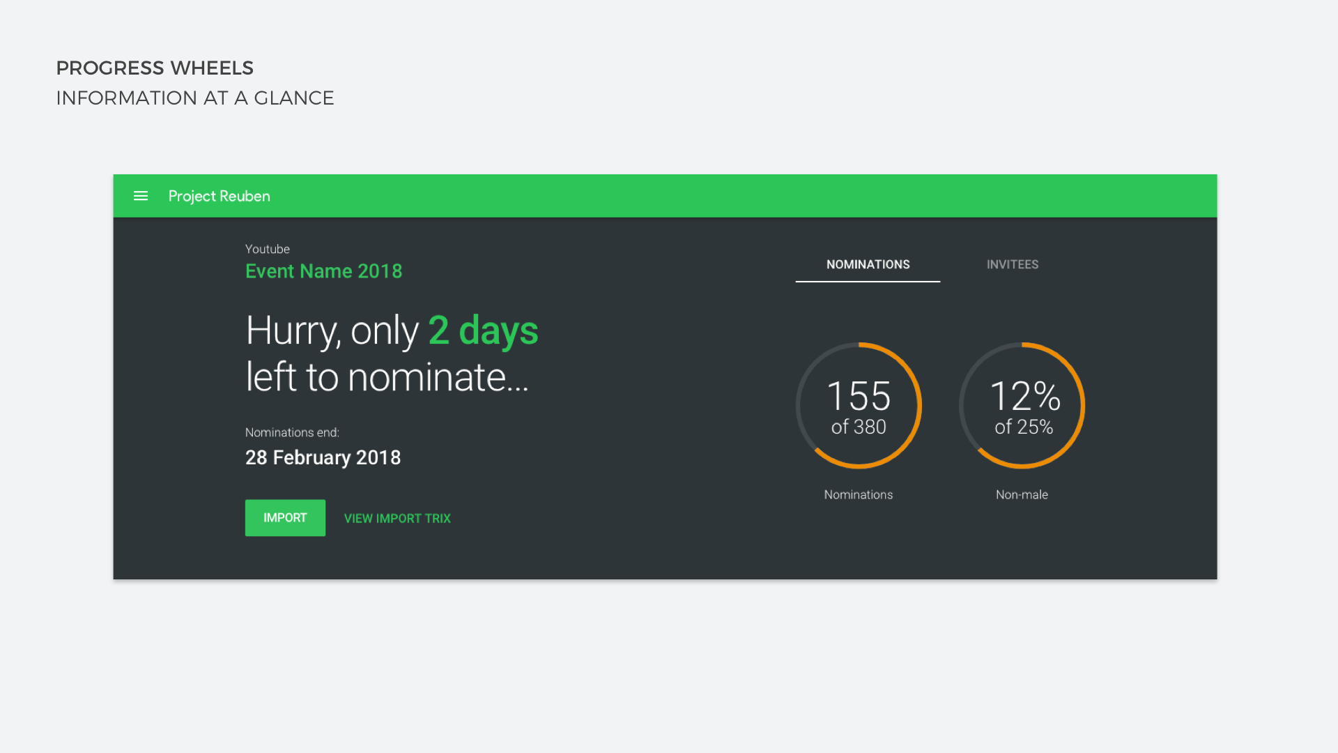
We had a time pressure on this project, Google I/O's first invitation phase was coming up, so we needed to get a minimal viable experience of this product out fast. I first thought that sticking true to Google's material design would be a good idea, but quickly found that we needed to show information in ways that would mean creating some custom components. I created an initial design that used only text to instruct the user on what actions they needed to take. This tested well, but users felt they had to do too much reading to get a full picture of how their team was performing against their invitation targets. I then introduced progress wheels into the main header of the page which gave a quick snap-shot of how teams were performing.
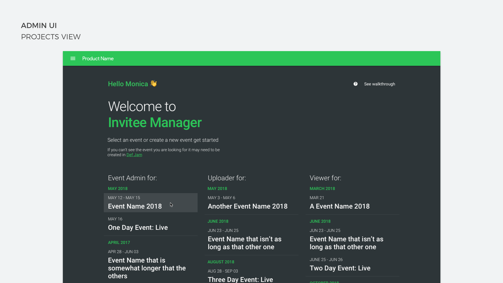
ALL THE USERS
Our tool was going to be used by multiple types of users. We had the admins who were setting up the event in the tool, the teams who were entering invitee information and then the invitees themselves (we already had UI that they would see). The process for each user was multi-stepped and pretty confusing at times, so I designed screens that would give the users the right contextual information as soon as they hit the page. If they needed to complete setup they would be asked for the missing information, if they needed to invite more of a certain demographic of people, then the UI would show them how they were doing against their targets. All of this information was previously calculated by a handful of individuals who had some impressive but complicated functions in Sheets. Then they would distribute this information to the teams one-by-one. Now the teams were able to see in real-time how they were hitting their targets.
MAKING DATA ENTRY FRIENDLY
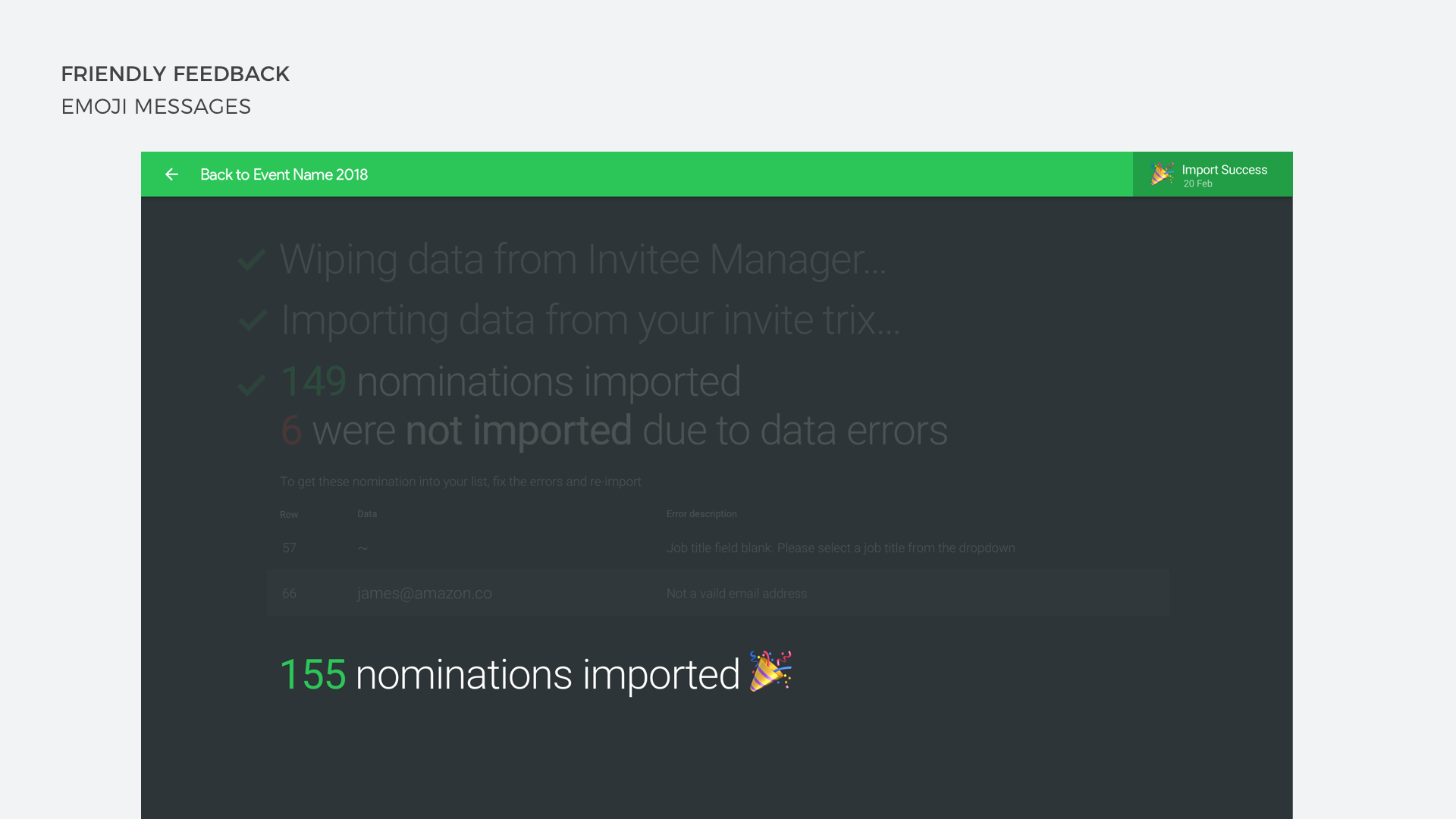
Even though our tool was now doing a lot of the heavy lifting in terms of tracking teams allocations and invitee information, it was still a big task for the teams using it and lots of those tasks were data entry. In an attempt to make it more of an enjoyable experience, I added little moments of delight into the tool. I used emojis to try and add some personality into the confirmation messaging shown when users submitted or saved information, as these were the moments during testing that users were most nervous about. After spending a lot of time entering information they hit a CTA hoping they got everything right, a well-timed and friendly message served to alleviate those fears while also being informative and helpful if there was an error.
THE RESULT
Google I/O was the first event that this tool would be used on and it went without a hitch. Events were straight forward to set up, teams had data about how they were performing against invitation targets, invitees were sent automated comms around RSVPs and all the information lived in one place so there was no need to copy and paste multiple sheets anymore. The people who used this tool said they had never spent such little effort chasing teams to complete their invite requests on time. As a bonus we also created a simple script that allowed the teams to create a Google Sheet in a shared folder and our app would pull information from it to populate the invitee information. This resulted in a minimal amount of disruption to the teams that were already working in this way.