Making digital for real life
The real world is constantly interrupted by our digital devices. What if we could create digital experiences that co-existed with the physical? I worked with Tate to tackle one of their visitors’ biggest pain points: not knowing which pieces of artwork in the vast collections they should see.
MY ROLE
Design Lead
THE TEAM
2 Designers + 4 Engineers
OUR TIMELINE
8 weeks
THE PROBLEM
With countless artworks on display by a huge list of artists, it’s easy to understand why many visitors wouldn't know where to start. Tate had invested in an app that was performing badly and wanted to create an app to enhance the visitor's experience when visiting the galleries.
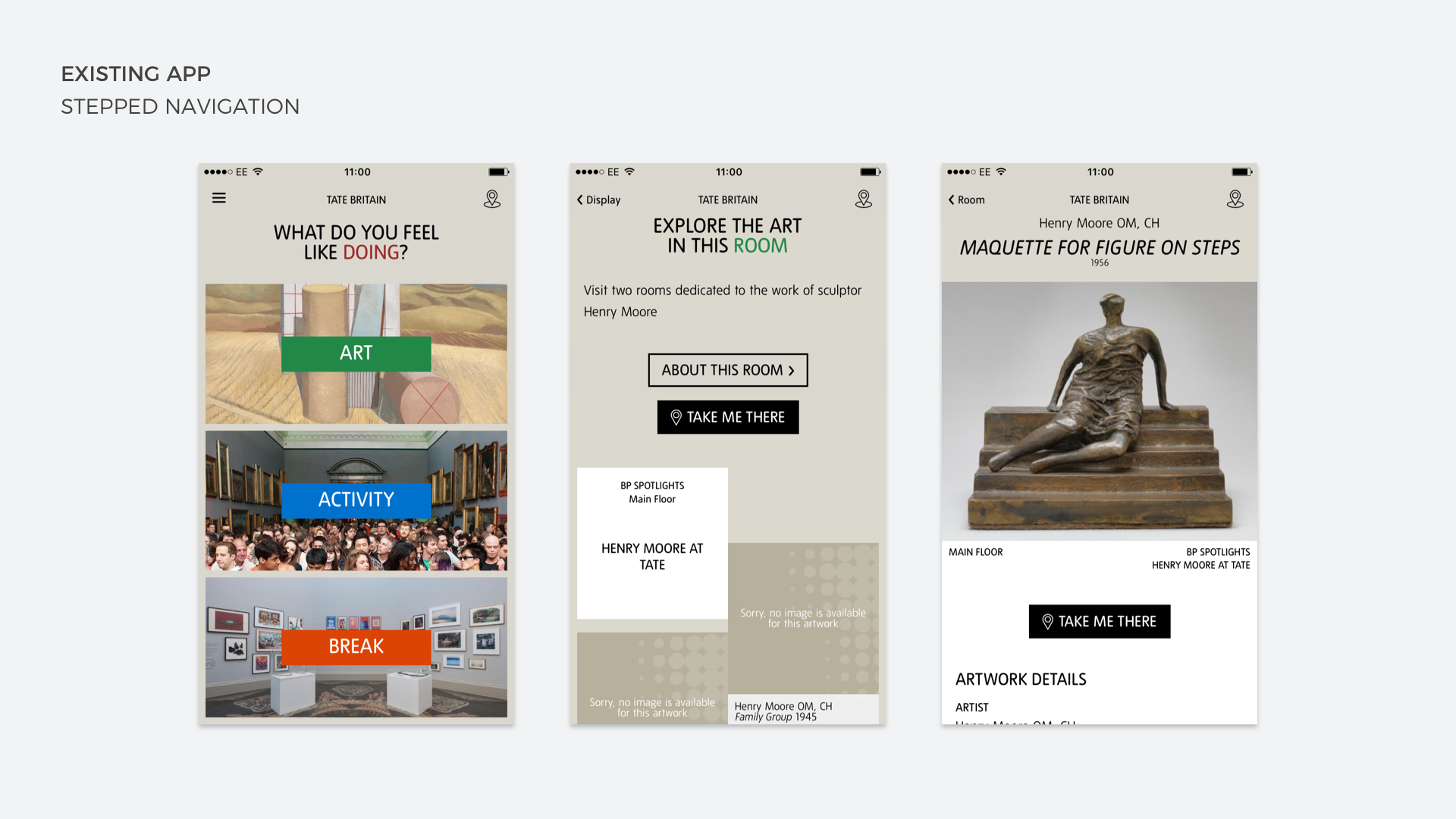
OFF ON THE WRONG FOOT
The Tate app had already completed an initial phase when Potato took on the project. This app allowed users to explore the catalogue of art the Tate gallery had to offer but wasn't able to always tell you if it was actually on display. It had some basic wayfinding that used beacon technology that the galleries had spent a considerable amount of time (and money) installing in all corners of their spaces, without really thinking what they were going to do with it. Right now most users were bouncing out of the app after only a few minutes of use. The client had given us a target - raise app usage time by 50%.
PUT YOURSELF IN THEIR SHOES
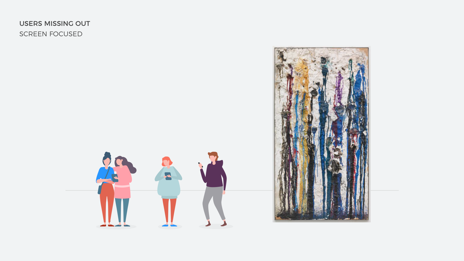
I wanted to gain a better understanding of what the visitor experience was like using the app. So one morning I headed to Tate Modern with the app in hand to gain some insights. The app did contain some valuable information if you dug deep enough, but I kept finding myself deeply focused on my device screen rather than enjoying the exhibitions. I noticed a few other people using the app, so feigning difficulty in how to use it I asked them to help me and every time they were just as screen focused as I was. It felt to me that creating an experience that took peoples attention away from the impressive pieces of art on display wasn't a good thing to do.
GALLERY TOURS
One of the things I noticed in my visit to the gallery was how popular a free guided tour that took place once a day was. There was a sign in one of the first rooms in the gallery that simply said - "Free guided tour starts here at 11:30". I saw that there was a large crowd gathered around this sign. It contained tourists, school groups, and people speaking different languages. At 11:30 a single tour guide came out and did his very best to try and direct the crowd around the room to talk about the artworks. The guide only spoke English, so half the crowd had no idea what he was saying and he had no microphone which meant people couldn't hear him at the back. Visitors were able to get tours in different languages and with headsets so they could hear, but these services cost the visitor money, and with Tate being a free to enter gallery many of its visitors were cash strapped tourists looking to have a free day out.
THE 'DING' MOMENT
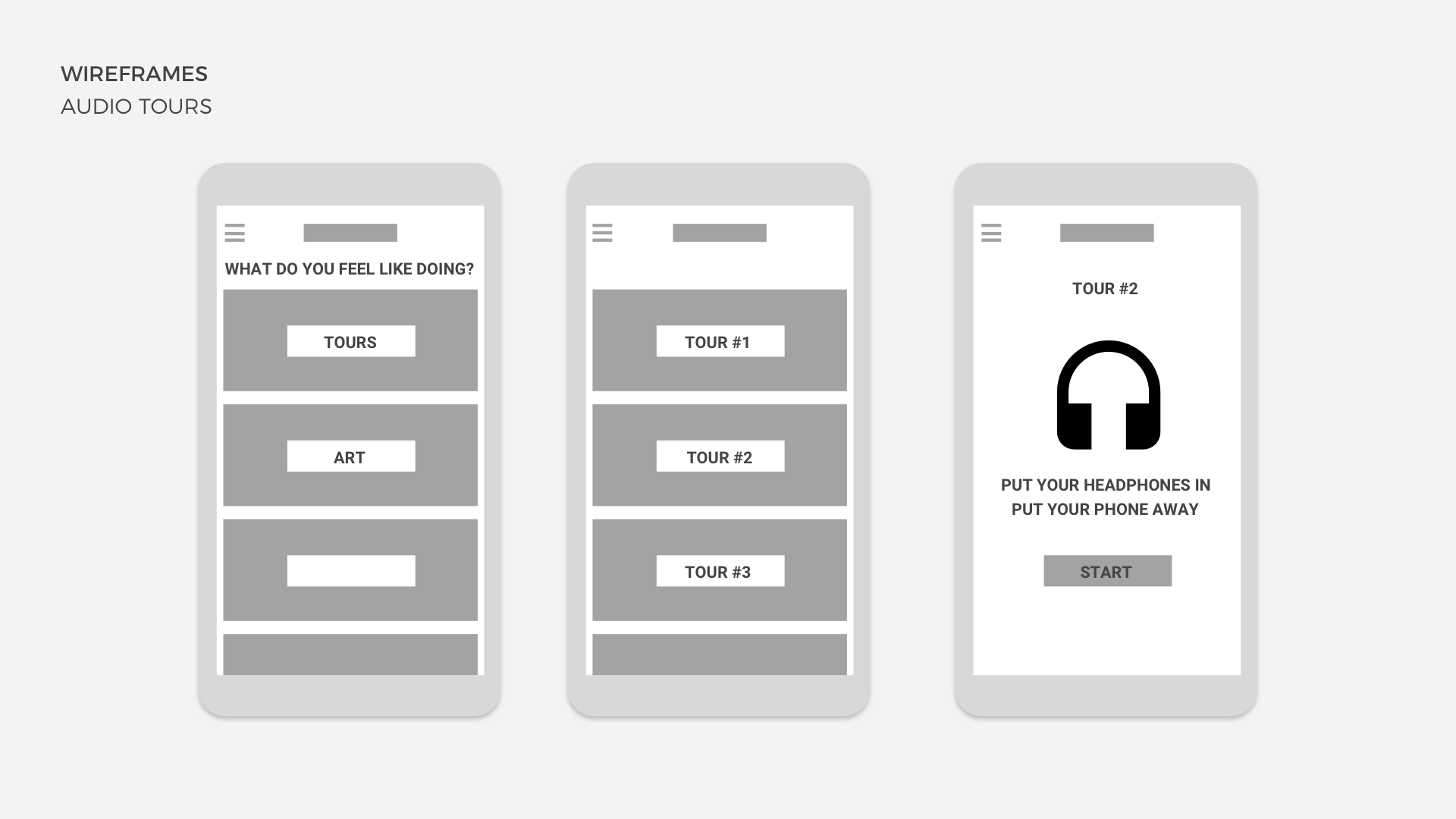
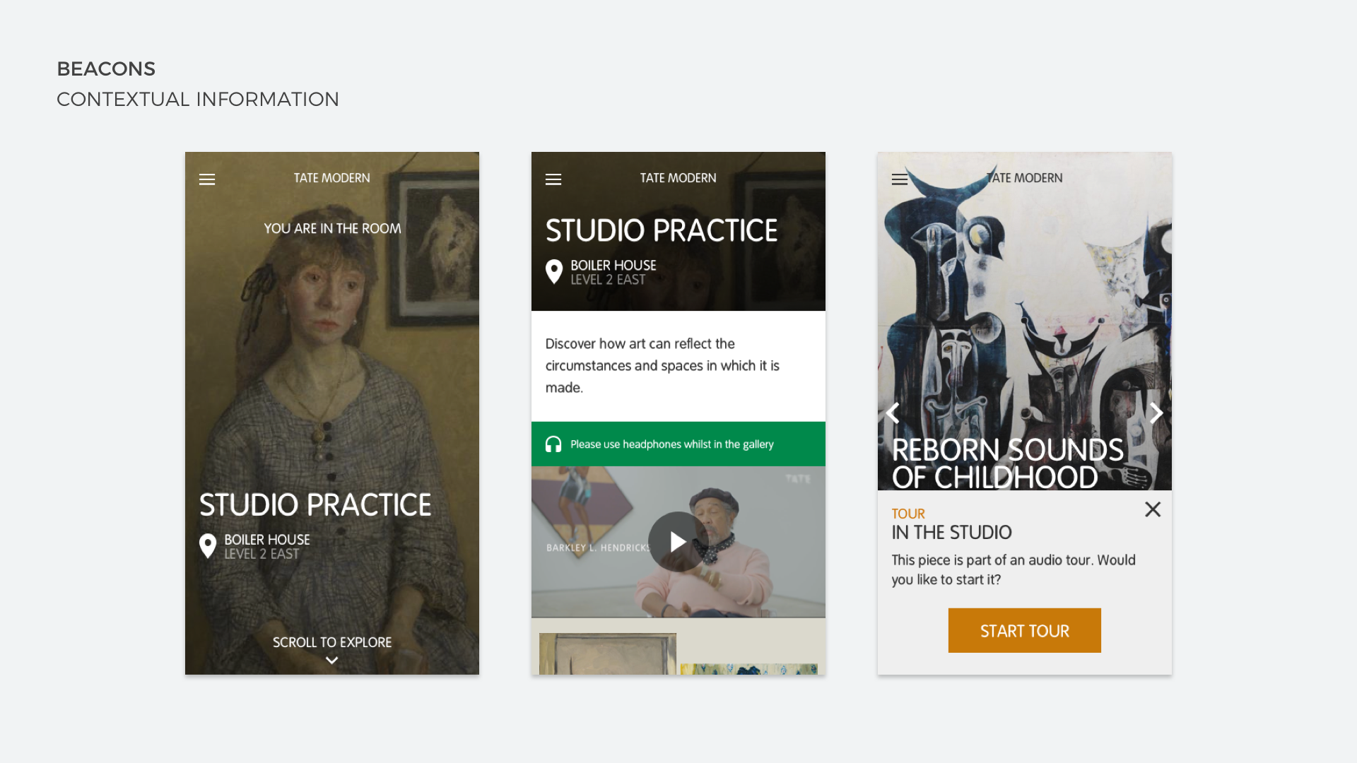
After seeing all this a lightbulb went off in my head. What if we were able to give people the information they wanted about the artwork without the tour guide. What if they were able to get the same information through the app, but delivered in a way that allowed them to focus on the exhibition and not on their device. I hypothesised that if users were able to access audio tours through the app that it would create a digital version of the free tour offered each day but without the large crowd. Users could take the tour when they wanted, go at a pace suited to them and also get the tour in whatever language they wanted.
SCREEN DOWNTIME
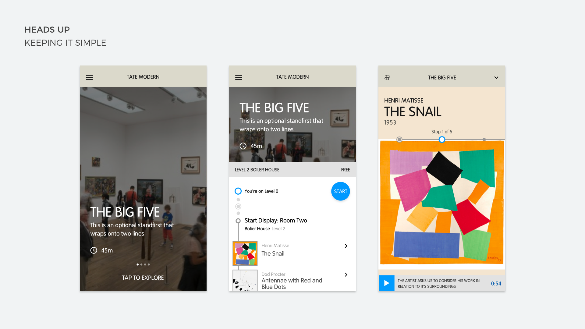
The current app required lots of attention to get to the good pieces of content, and while that was okay for users planning their visit, it wasn't great when in the gallery. I wanted to design an experience that would allow users to forget that they were using an app. I wanted users to be able to pick a tour, put their headphones on, hit go and put the device in their pocket so that they could focus on the artworks around them. To help with the immersion I designed screens that would give the user audio directions to guide them to the next piece of the tour so that they didn’t miss any of the greatest pieces.
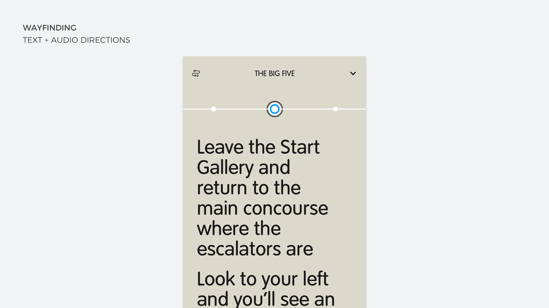
NOT ALL WHO WANDER ARE LOST
I also created a mode that allowed users to walk freely around the gallery without having to take a particular route. The beacons that Tate had placed all over their spaces allowed us to place a user in a particular room, and in some cases in front of a certain piece of art. Using this location data we were able to give visitors an additional layer of contextual information about individual pieces of art they were stood in front of.
THE RESULT
Through testing the first iteration of the guided tours with users, we were able to gain back valuable insights into how they were using it. Users loved that they were able to get around the gallery in their language (our app would detect the language the device was in and automatically change). App usage went up by 65% and when we released the app we saw the biggest spike in downloads that had been seen since launch.
You can view a lofi version of the app prototype here